How to look high-end to clients as a freelancer or small studio (2026)
How freelancers and small studios look premium to clients: branded proposals, consistent touchpoints, a booking page and a portal, and the details.

By Simon Dziak, Founder, Workspace369 · LinkedIn
Clients rarely compare freelancers on talent alone, because they cannot judge it well. They judge what they can see: how quickly you reply, how clear the proposal is, whether the paperwork looks like a business sent it.
That is good news for a solo freelancer or a small studio. Premium is a set of small, consistent decisions, not a budget. Here is how to make them, starting with the proposal your client actually reads.
What's inside?
Quick answerWhat "high-end" means to a clientPositioning beyond "small"Touchpoint 1: the proposalTouchpoint 2: the contract and the signatureTouchpoint 3: the booking pageConsistency across touchpointsTouchpoint 4: invoices and paymentsTouchpoint 5: the client portalBranded proposals in actionA one-hour polish passWhat not to doWords that make a proposal feel expensiveWhen a team of two or three looks even betterFinal recommendation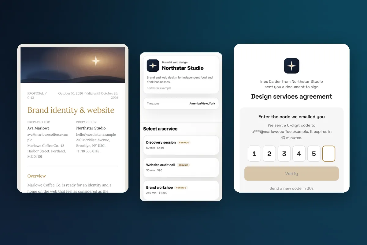
Quick answer
Make five touchpoints match: proposal, contract, booking page, invoice and portal. Use one logo, one accent color, one voice. Cut anything that makes the client hunt: attachments in five emails, a password they have to create, a payment link that goes somewhere unfamiliar. Add a cover image to your proposal, state the price and deposit clearly, and give every message one next step. A branded proposal in Workspace369 takes minutes to set up, and the rest is discipline.
What "high-end" means to a client
Strip the buzzwords. In practice a client reads premium from:
- Clarity. They know what they get, what it costs, and what happens next.
- Consistency. Every document looks like it came from the same business.
- Speed. Replies and next steps arrive while they are still interested.
- Calm. No chasing, no confusion, no surprise charges.
None of these require being big. Large firms often fail at all four.
Positioning beyond "small"
Do not apologize for your size, and do not pretend to be larger. Name the advantage: senior attention, one point of contact, fast decisions. Then support the claim with a process that looks organized.
Phrases that work:
- "You work directly with me."
- "Here is the plan, the price, and the start date."
- "You will get a link to review, accept and pay a deposit. I will confirm within the day."
Phrases to drop: "just a small studio", "I hope this is okay", "whenever you get a chance." The tone is helpful and certain.
Touchpoint 1: the proposal
This is the page that decides the job. Make it feel designed.
- Cover. Your logo, the client name, the project title, one cover image.
- Theme and accent. Pick one of the preset themes and one accent color that matches your logo. In Workspace369 the proposal Design tab offers four themes, accent swatches plus a custom color, four page backgrounds and a cover image.
- Layout. One column, plenty of white space, headings that scan.
- Price block. Line items with clear names, optional add-ons that the client can tick, the total, and the deposit.
- Next step. One button.
The wording guide for the body is in how to write a proposal.
Touchpoint 2: the contract and the signature
Clients take a business more seriously when the agreement arrives without effort. Prepare a template per service, attach it to the proposal, and set the expectation: after accepting, there is a second page to sign, with a short code sent to their email. It reads as secure and organized, because it is.
Keep the agreement itself short and in plain language. Have a lawyer review the wording for your location.
Touchpoint 3: the booking page
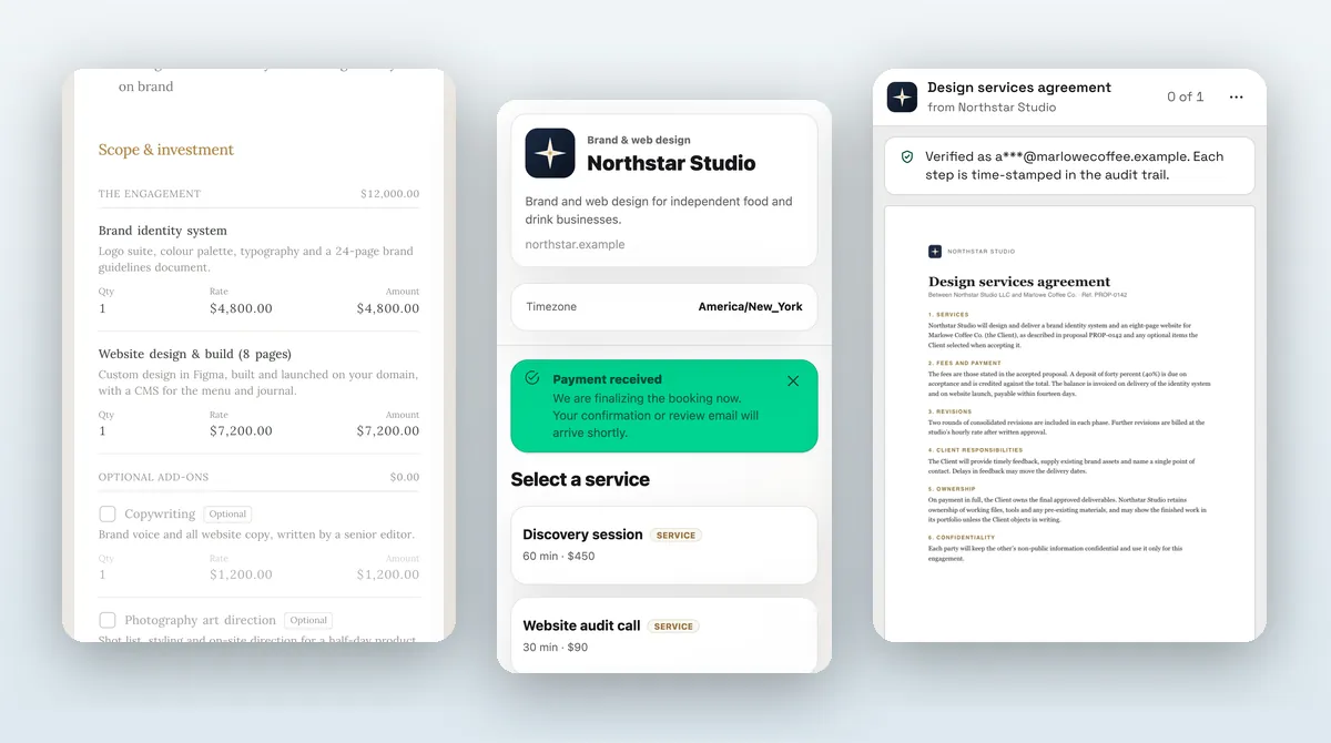
If you sell sessions or calls, a booking page replaces five emails of "does Tuesday work?" The client picks a service and a time, and can pay a deposit before the slot is held. Booking pages are available from the Specialist plan.
Premium details here are small: a logo, brand color, a clean service list with clear durations, and a confirmation message that says what to prepare.
Consistency across touchpoints
Make a one-page style card for yourself:
| Element | Decision |
|---|---|
| Logo | One horizontal and one square version |
| Accent color | One hex value, used everywhere |
| Fonts | The closest preset on each surface |
| Tone | First person, short sentences, no filler |
| Sign-off | The same name and role every time |
| Next step | One per message |
Open each client-facing surface and compare. The proposal, invoice, booking page and portal should look like siblings. Where a surface offers presets only, pick the closest match and move on.
Touchpoint 4: invoices and payments
A cheap-looking invoice undoes a good proposal. Use your logo, the same accent color, a clear payment link and a due date. Online payment with Stripe means the client pays on a familiar page rather than copying bank details. For follow-up wording, see the invoice email templates and payment reminder examples.
Touchpoint 5: the client portal
For ongoing work, a portal gives the client one place for projects, invoices and contracts. It is optional for the client and set up separately from proposals. If you work with agencies or repeat clients, see client portals for agencies.
Branded proposals in action
Here is what to capture and compare when you set this up. Every capture below is a real client-facing screen using a sample studio.
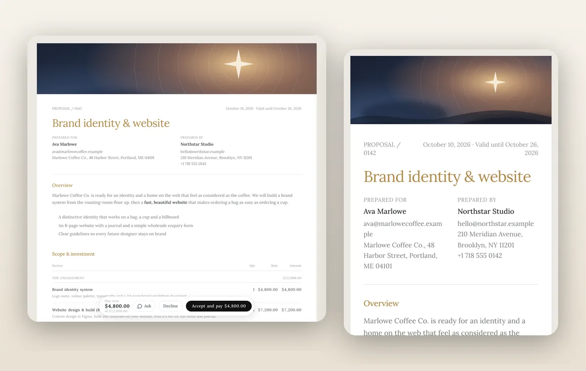
The cover and theme come from the proposal Design tab. For what you can customize across documents, read branding.
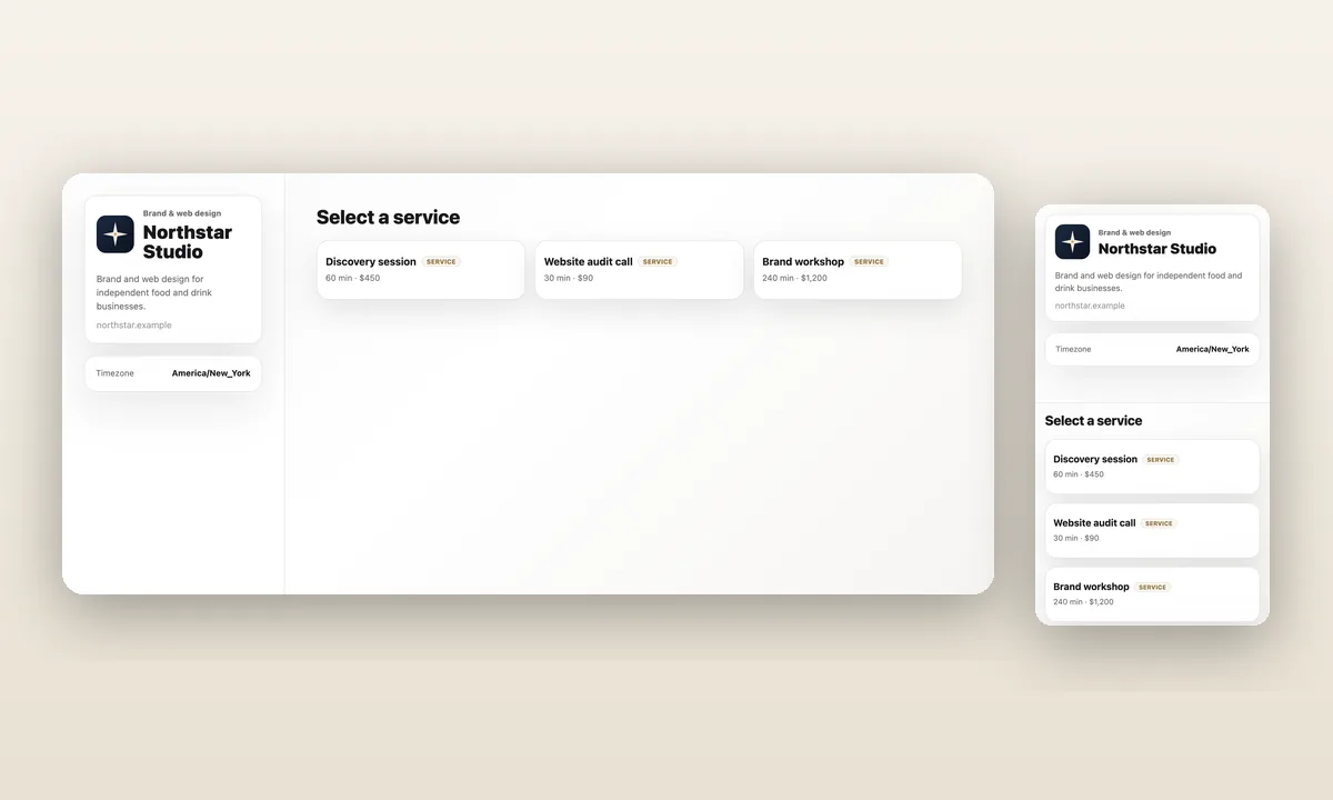
The booking page is branded separately, with brand color, layout and preset fonts. See communications for how clients reach you once they are booked, and the client portal for the ongoing view.
A one-hour polish pass
- Upload your logo and choose the accent color.
- Build one proposal template with a cover image.
- Attach your standard contract to the template.
- Set the deposit amount and test a small payment yourself.
- If you have Specialist, publish a booking page with two or three services.
- Send yourself a proposal and read it on your phone.
If anything makes you hesitate on your phone, fix it before a client sees it.
What not to do
- Do not use five accent colors.
- Do not change your look for every client.
- Do not hide the price. Clarity beats mystery.
- Do not promise what the page cannot do. If you ship a booking page, make sure services and times are real.
Words that make a proposal feel expensive
Design gets the first impression, copy keeps it. A few habits separate a confident proposal from an anxious one:
- Lead with the result. "A brand system your team can use on day one" beats "Here is what I will do."
- Use specific numbers. Dates, counts of deliverables and revision rounds read as planned. Vague phrases read as improvised.
- State exclusions. Saying what is not included shows you have run this kind of project before.
- Say what happens next, in order. Accept, sign, pay the deposit, kickoff on a named date.
- Cut hedges. Delete "just", "I think", "hopefully" and "if that works".
Read the proposal aloud. Anywhere you would not say the sentence to a client's face, rewrite it.
When a team of two or three looks even better
Small studios have a hidden advantage: consistent roles. Name who the client talks to, who delivers, and who invoices, and keep that division on the proposal. A client who sees clear roles assumes a mature operation. Use the portal for ongoing communication so the client sees one thread of work, not three people's email styles. If you are growing into an agency, the same touchpoints apply, with seats and permissions added as you hire.
Final recommendation
You will not out-budget an agency, and you do not have to. Pick one look, apply it to the proposal first, and then the booking page, invoice and portal. Consistent beats elaborate. For a broader setup, the freelance business software overview shows how the pieces fit.
Put it into practice
Run client follow-up in one workspace.
CRM, inbox, voice, invoicing, payments, projects, files, AI, and workflow automations — connected instead of exported.